Designs that work across all platforms
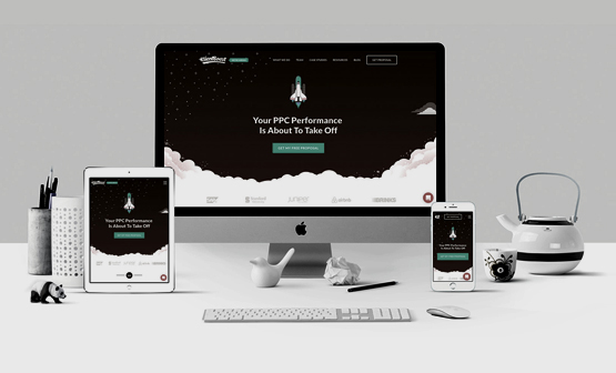
Responsive design is one of the most important elements and aspects of a user interface (UI) design. When designing an app, UI, or webpage, the designer must keep in mind that the UI should be adaptive enough to fit and adapt to all the screens and resolutions, be it a tablet, smartphone, or desktop. A responsive UI can be opened in any device regardless of their screen size; they are the real treasure of product development. They offer multiple benefits such as – they cover more devices and more users; they save the development and maintenance efforts as they require only one codebase and look and feel good and very intuitive to use.
Achieving a responsive design is tough because most modern-day UI, web pages, and web apps are optimized to work on desktops. With a large number of users using their smartphones or tablets to access these apps and web pages, it becomes hard to navigate through these devices. The solution to providing a consistent user experience across platforms was to create versions of the apps and webpages for different devices. Still, it was not conventional, and all the versions needed to be worked and maintained independently, which takes more time and money. The alternative to this was to use a responsive design; users can easily view and navigate the same app and web page on any device.
Responsive Design you can be Proud of
At e-Global Soft Solutions, our team uses the latest technologies and tools to achieve a responsive design that users can view on any device regardless of their screen size. We are an IT and Web development company filled with experienced young and brilliant minds who can take any challenge and complete it in the given time. Our designers have made hundreds of web pages, UIs, and apps to be mobile-friendly and improve the way it looks on mobile devices. Our designers are fluid with the workings of the tools to make the web pages and apps look more user-friendly and mobile-friendly.
At e-Global Soft Solutions, our ultimate goal to achieve responsive design is to avoid any unnecessary resizing, scrolling, zooming, or panning that happens on web pages. We focus on making sure that the web page or UI user experience can be as responsive as possible to access it from any device, thus increasing users' and the web page and UI user base. We create designs that give consistent performance across devices and platforms to enhance the user experience and brand reputation for the business.