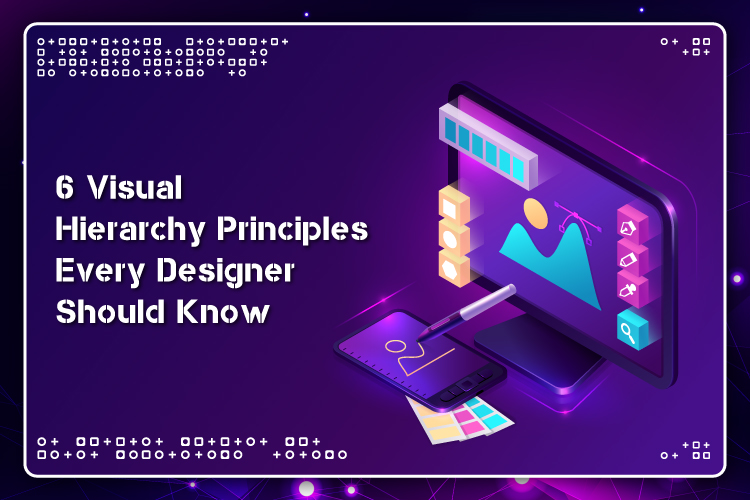
6 Visual Hierarchy Principles Every Designer Should Know
We are all living in a fast-changing world. As the technology to show a page continues to evolve, it is the responsibility of designers to organize the content clearly on a page.
But the question is – what is the best way to do that? The short answer is visual hierarchy.
Visual hierarchy can be defined as the arrangement of design elements in order of their importance. A graphic element’s visual weight determines its significance in the visual hierarchy, conveying to the user’s eyes what to focus on and in what order. It helps direct the readers’ eyes to the crucial content first and then to the secondary ones.
With the attention spans getting shorter and shorter, you must immediately guide the viewers’ eyes to the crucial information.
From brochures to websites to apps, these six visual hierarchy principles will help you design everything while ensuring a positive experience for the users.
1. Reading Patterns
People follow the same top-to-the-bottom reading pattern, and the majority of them read from left to right. But even though knowing this is crucial for a functional page design, the designers realize that the task is much more complicated.
According to recent studies, people usually scan a page first to get an idea of whether or not they are interested before they commit to reading it. These scanning patterns are likely to take either “F” or “Z” shapes, and designers can undoubtedly capitalize on this in their design.
F-Pattern
This pattern generally applies to conventional, text-heavy pages such as blog posts or articles. A user moves down, scanning the left side of the page, searching for any captivating keywords in the left-aligned headings or first sentences of each topic, then pausing and reading to the right when s/he runs into something interesting. The end result of this scanning resembles something like an F or E or some shape with even more horizontal lines, but the “F” pattern has stayed.
Wondering how you can use this? You can align your crucial information to the left and utilize short headlines in bold, bullet points, and other such attention-capturing elements to separate different paragraph blocks.
Z-Pattern
This pattern generally applies to other types of pages such as websites or ads where the content is not inevitably put up in block paragraphs. A user first scans across the top of the page where the crucial information is probably present, creating an imaginary horizontal line. Then, s/he sharply moves down to the opposite end of the page, creating an imaginary diagonal line, and then scans across the bottom of the page, hoping to find some useful information.
Web designers often build the pages complying with this scanning behavior consciously, putting the most valuable information in the corners, placing the remaining crucial information on the top and bottom bars, and joining the diagonal.
2. Size Makes a Difference
This one is quite simple; actually – people read things that are bigger in size first. It is normal behavior for readers to notice the more prominent texts first on a page. It goes without saying that larger elements draw more attention than smaller ones. And that’s one of the reasons why significant newspaper headlines are often written in large, bold format – to capture our attention right away!
If truth be told, the fun fact is that this tendency of people is powerful enough to overrule the top to the bottom reading habit.
Designers can make use of this by making the engaging topics or headings bigger in size so that the viewers read them first.
3. Space and Texture
One of the best ways to grab your readers’ attention is by allowing your content sufficient space to breathe. Leaving considerable negative space around a button or broadly tracking lines in a text block will make these elements pop up and more easily visible to the viewers.
It makes such a huge difference that even a text written in a tiny font can become readily visible if you leave out ample white space around it, signaling its importance. Likewise, you can lay extra emphasis on a specific text by placing it in a box, separating it from the surrounding space.
When we talk about texture in respect of visual hierarchy, we are not referring to graphic texture effects. Instead, this type of “texture” refers to the complete arrangement or pattern of text, space, and other details on the page. It plays a significant role in determining the position of a design element in the visual hierarchy.
4. Typeface Weight and Pairing
The typeface you select is crucial to building a visual hierarchy. A typeface’s most important characteristics include its weight (the breadth of the lines that make up its letters) and style (such as sans serif and serif). However, other refinements such as italicizing can also play a notable role. You need to have a contrast between typefaces.
Remember, typeface strongly impacts the hierarchy order of the design elements. Nevertheless, there might be a few cases where you need to show an array of information as equally urgent. While you can accomplish the equivalency by setting all of it to the same size, doing so would also make it monotonous simultaneously. One way to avoid this is to differentiate the typefaces.
5. Color and Tint
Here is another obvious fact – vibrant colors stick out from grayscale or muted colors. Lighter tints seem more “far,” and therefore, they go lower on the hierarchy than the darker and more vibrant ones. You can play with different shades of colors to create a striking effect and highlight the crucial information and sections on the page.
Colors play a much more vital role in mobile app design since the small screen size restricts your ability to employ other tactics such as wider spacing and size differentiation.
6. Direction
Designers typically design the page layouts as per a grid of horizontal and vertical lines, both by tradition and because that is the most readable format. Such a system gives rise to a new way of building hierarchy – break the grid.
Text presented on a diagonal or curve will naturally stick out against its surrounding grid-locked text, taking all the limelight. This is a proven strategy that has been widely used in advertisements for a long time.
Wrapping It Up
Responsive frameworks are increasingly pushing designers to think about numerous different pages at the same time. Caught between dense text and shorter attention spans, designers need to figure out how to make sure the readers’ eyes notice the most valuable information first. These six principles of visual hierarchy exactly do that. However, remember the key is to practice. Learning this is not enough; you need to implement it as well. Try out different styles to get a better idea of how this works. Keep these in mind the next time you sit down to design a page!